Monday, January 3, 2022

Viseart Holiday 2021 ::: Cashmere Etendu Palette Review & Swatches!

 Talking about the Cashmere Palette from Viseart's Holiday Collection this year!


Full disclosure: Viseart gifted me this palette along with their other Holiday palettes but with no obligation to post!

This is the last palette I will talk about from their holiday collection this year, I have already talked about the Bijouxette (click here), Paris Etoile (click here) and Petit Fours (click here). 

I could not manage to talk about this before the holidays but hey, these are such pretty everyday neutrals you don't need to wait for holidays to wear these! Some of you might already know I do not gravitate towards neutral shades, especially cool toned neutral shades. But may be because of this, this palette feels a bit new-ish color scheme wise. And I loved playing with all the shades! May be I was a neutral lover after all!

Formula: Before I had this holiday collection, I already had 6 palettes from Viseart. So that should already tell you how much I love their formula. I adore their matte shadows - they are so easy to work with. I can blend their mattes with ease, I can place them strategically without getting muddy, I can mix them with lighter or darker shades to make them deeper or brighter. Even with deeper mattes like blue or dark green, I find them comparatively much easier to work with than some other brands. And because their mattes get more love from me, I don't pay much attention to their shimmers 😄! But they are also such a joy to work with. They are opaque, very shiny and almost minimum to no fall-out. I prefer using them with my fingertips than using with a brush.

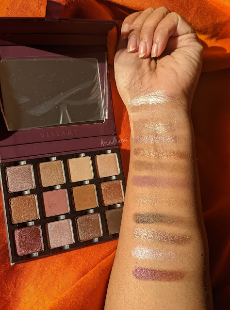
Color: This is a neutral palette and I love that it leans more towards cool tones than warm tones! There are two golden shades but they are not overly gold. I like that. Let's take a closer look at the shades!

Bubbles - Described as palest pinky lilac champagne satin metallic. Such beautiful lilac mauvy shade. I feel like I have used it every time I have used this palette.

Laughter - Described as nude beige satin metallic with a shimmer finish. Similar shade as Bubbles but warmer and golden hued. This along with Bootlegger, Jazz and Burlesque will make a beautiful warm toned eye look. 

Feather - Described as pale vanilla with a matte finish. Great shade to have if you have a very light skintone. For me it does not do anything. 

Pearls - Described as blushed tan with a satin metallic shimmer finish. Very smooth texture. I have used it as a highlighter on top of my cream highlighter! 

Burlesque - Described as metallic caramel hue with a duochromatic finish. There are duochromatic sparkles for sure but I have not really played a whole lot with this shade to know if that transfers on the eyes. I love the shade though.

Flapper - Described as dusty midtone plum with a matte finish. I love this shade. Very appropriately mid-tones so it is useful for a broader range of skintone. Also the perfect midtone you want to use when you want a cooler tone look. LOVE it. 

Bootlegger - Described as sienna midtone brown with a matte finish. It is a perfect warm counterpart to Flapper. I know for sure that this shade is going to get used very heavily in my looks. I am glad they included it here. 

Jazz - Described as light rose gold with a duochromatic finish. Very soft texture and I love the duochrmatic speckles. It warm and kind of golden but I love that it not way too golden.

Roaring - Described as metallic deep burgundy with duochromatic finish. This is shade that I have been using a lot. Feels like they did not add too may deep shimmers so everytime I want to add more depth but in shimmer, I end up using it. 

Twenties - Described as pale lilac with a satin metallic shimmer finish. It is too light for me to use on my lid often, but I love it as a inner corner highlight. 

Retro - Described as pewter with a satin metallic finish. Another great shade with such a smooth texture. I absolutely adore this shade. 

Cigar - Described as deep expresso brown with a matte finish. Last shade in the palette but my absolute favorite shade. I love how deep and dark this shade is and how easy it is to use. I am finding great use for it. 

Staying Power: I always use eye primer with my eye looks. But I love their formula - it has great staying power. It stays put till I remove at night when I wash my face.

Packaging: This is their Ettendu palette so it follows a typical sizing, I love the green festive outer cover too! Their palettes now has mostly removable magnetic pans which are amazing in case you want to create custom color schemes. I really love that about their newer packaging styles.

Price & Availability: This palette will cost you $44 at full price for a total of 18 gram or 0.63 oz. But this is holiday season so I am quite sure you will get some discount or other. Also it is very easy to find Viseart these days; they retail at their own website (Viseart), BeautylishCamera Ready Cosmetics, and Muse Beauty Pro.

Here are the 3 looks I created using only this palette so far, I am sure I will play with it more and have more fun.


Lastly some video swatches! Such pretty shades!


Did you pick up any palette from this holiday collection?

Love,

~Arrru

Sunday, January 2, 2022

Viseart Holiday 2021 ::: Petit Fours - Lapis, Peridot, Garnet & Bullion Palette Review & Swatches!

Talking about the Petit Fours - Lapis, Peridot, Garnet & Bullion from Viseart's Holiday Collection this year!


Full disclosure: Viseart gifted me this palette along with their other Holiday palettes but with no obligation to post!

As found in their website - "unashamedly hedonistic and luxe these fab Petits Fours are high octane moments of glorious glamour. Whether you are drawn to the classic gold and black drama of Bullion, the fiery fabulousness of Garnet, the deeply elegant and enigmatic Peridot or exuberantly exquisite Lapis we have just the Petit Four for you."

Here is the thing - I don't like four pan palettes. It gets too restrictive for me. I much rather prefer single shades or medium to bigger size palettes. I am so glad they sent me these gifts, and I appreciate it so much. Otherwise, I don't think I would have invested in any of the four-pan palette. 

Formula: I think at this point I am repeating myself, but I really love Viseart's formula. I adore their matte shadows - they are so easy to work with. At this point, I have used all of the shades at least once, and they are all wonderful to work with. I did not own a matte black from Viseart before and Glided from Bullion is so good. There are different types of shimmery shadows within the four palettes and they are all so good. 

Color: As you can see, they focused on one primary/popular color to build the palettes, and I think they did a good job. None of the shades are exactly same but there are similar tones. Lets take a closer look.

Peridot: I am not a big fan of green as a color but I love this palette. They chose just the right tone of green. 

Greenlight - Described as forest green with a metallic finish. So shimmery & deep but still colorful - I love it.  

Gimlet - Described as a royal blue (I think its a typo) with metallic. I think it is the most beautiful psubtle parrot green type of shade. Very shiny. I really enjoy it.  

Gatsby - Described khaki with a metallic finish. Oooooh, such a good khaki shade. Very deep almost like a brown green shade. Great for adding depth or use as a liner.    

Illusion - Described as soft, neutral buff-brown with a matte finish. Only skin-tone shade among these four palettes that is useful for me. Great for using on my crease. 

Bullion: We love a gold and black theme for holidays, right?  

Brazen - Described as antiqued gold with metallic finish. It is a little bit particle-y to touch but on the eyes, that is not a problem.  

1919 - Described as medium gold with a metallic finish. Not too warm, not too cool.  

Follies - Described as light gold with a metallic finish. Much cooler tone than the other two golds. 

Gilded - Described as natural black with a matte finish. I did not have a matte black from Viseart before, so I am super happy about that. It is perfect. I blend it to the high heaven for one look and it did not have much fall-out at all. It does not necessarily swatch that strongly, but I am very excited about this particular shade.  

Garnet: As the name suggests, the palette showcases the garnet shade. They included two gold -like shades but I would have loved if there were more pinks or reddish shades compared to gold.   

Cordial - Described as rich burgundy with metallic finish. Love it - I am very sure I will be able to use it in many different ways into my eye-looks.   

Vedette - Described as copper with a metallic finish. I love coppers, it really suits by brown eyes. Also this finish on this shade is so smooth. Definitely a favorite.   

Cabaret - Described as golden bronze with a metallic finish. Nice shade - nothing spectacular about it.  

Pigalle - Described as vanila-peach with a matte finish. Okay, this is where my actual complain starts. It is a very light beige shade. Does not do much for me and I am sure skintones darker than me has the same problem. 

Lapis: I absolutely love BLUE eyeshadows so obviously this is going to be my favorite among these four palettes.   

Night Owl - Described as royal blue with metallic finish. I am in love with this shade. So strong, so impactful and such a deep but bright blue shade. Performs extremely well.    

Bauhaus - Described as silver with a metallic finish. Another beautiful shade. I have only used it once so far, need to use it more.    

19th - Described as golden nude with a metallic finish. Nice shade - nothing spectacular about it.

Blue Moon - Described as vanila-peach with a matte finish. So, yes, it is quite similar to Pigalle. So same problem. Formula is perfect but the shade does not work for me.   

As I mentioned before, my main complain is that out of 3 skin-tone mattes among these four palettes, two of them are very similar light beige and the other one is just slightly darker. I think they could have added at least one much darker skin-tone shade. 

Staying Power: I always use eye primer with my eye looks. But I love their formula - it has great staying power. It stays put till I remove at night when I wash my face.

Packaging: Simple practical packaging. one of the reason I struggle with petit four palettes is the storage. Not my favorite. But that's a personal problem. I do enjoy the fact that I can mix & match these shades to create my own palette. 

Price & Availability: This palette will cost you $25 at full price for a total of 6 gram or 0.21 oz. But this is holiday season so I am quite sure you will get some discount or other. Also it is very easy to find Viseart these days; they retail at their own website (Viseart), BeautylishCamera Ready Cosmetics, and Muse Beauty Pro.

Here are some of the looks I created using these palettes so far! Do you have any favorites? Which color story intrigues you the most?


Lastly some video swatches! Such pretty shades!


Love,

~Arrru