Today, I am talking about Viseart Editorial Brights palette!

I actually do not think I really need to specifically talk about it! If you follow me on Instagram (find me here) you may already know how much I adore this palette. I got it sometime last year and I have been using it in a lot of looks. And of course have been talking about the palette on my IG posts non-stop!
I love vibrant colors and I have desired this palette for a long time. And I knew that I will love it. But it is definitely becoming one of the most loved products in my makeup collection! If a materialistic item could make me TRUELY happy, this palette would be among the top five item in my life; I know it is a dramatic statement but I am only expressing my feelings.

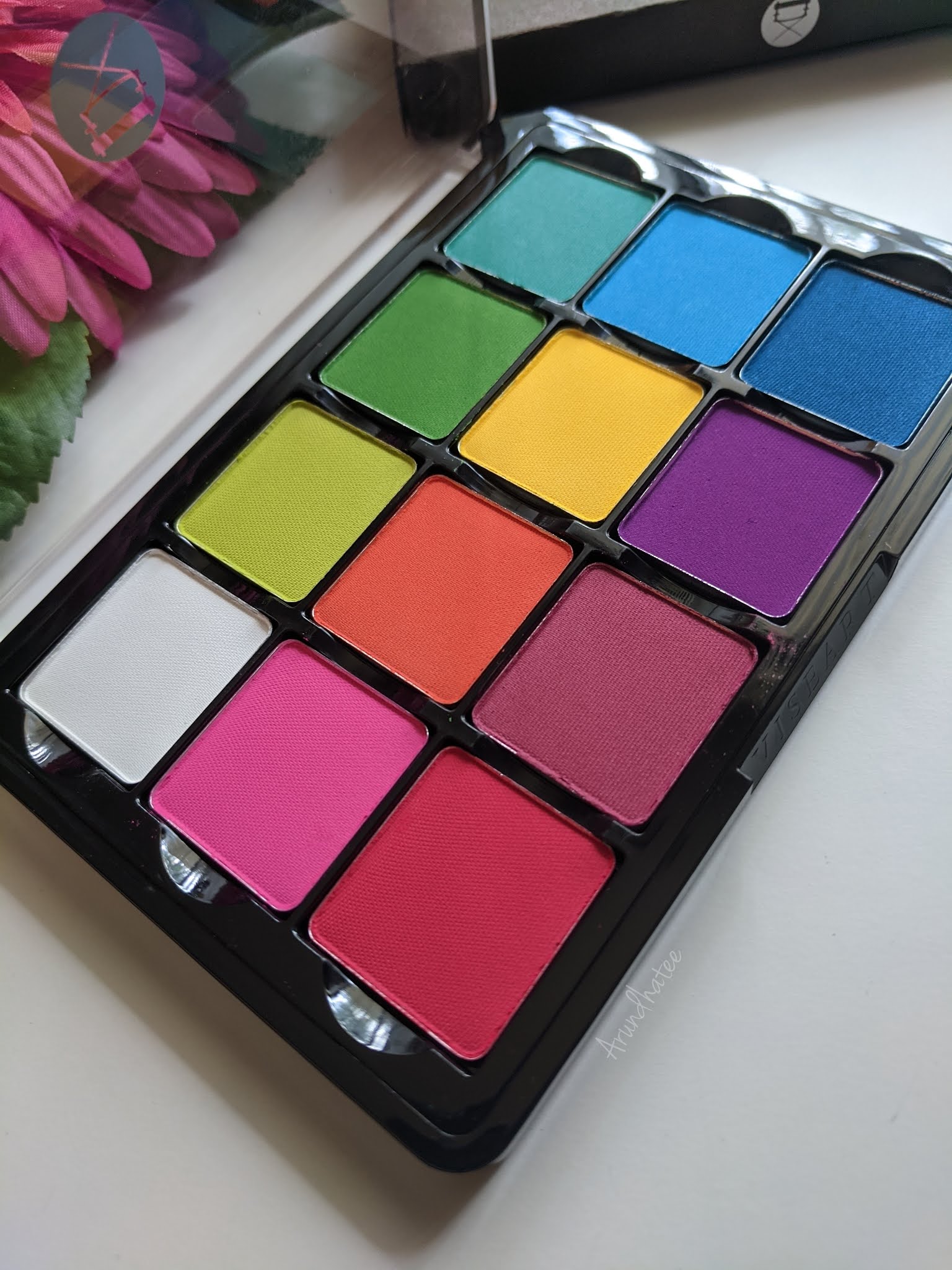
Color Story: This is one of the very classic palettes offered by Viseart! As the name suggests, it is full of vivid colors - pinks, reds, blues, greens and purples. And there is also a white which is quite convenient cause you can mix white with the other colors to create pastel versions of the colorful shades. One thing that bugs me a little bit is how the colors are arranged (they seem random to my eyes) but these are removable pans so you can easily interchange and arrange them per your choice. Let's talk about the colors one by one -


White: Beautiful white shade, it shows up on my olive Indian skin-tone. It also mixes well with other shades so definitely a very useful shade in the palette.
Pink: Beautiful vivid pink, very easy to work with as well. Pinks are not my go to choice for colors, but I do love using this one.
Red: Great red shade - easy to work with as well. My complaint with this one is that once you start blending this, it tends to turn into more of dark pink than red! It is still a great shadow to work with but I just hoped it would be more of a true red, may be more blue leaning then pink!
Lime Green: This is such a pretty lime green shade! Very comfortable to work with as well.
Orange: This is a very bright, very coral type of orange. It is one of my fav colors in general to experiment with! So I of course, love it.
Magenta: This is the color in the palette that I don't gravitate towards much. It does not appear too different than the red and the purple. I mean, it works perfectly fine but it is not that interesting to me.
Bright Green: Another beautiful green. I expect this type of color to be a little difficult to work with but the one in this palette does not give me any difficulty with blending or while placing it strategically in a definite spot on my eyelid!


Yellow: Aah, this is one of my MOST favorite shades in this palette. It is such a happy yellow. And the great thing is that, it shows up as vibrant against my skin-tone as it appears on the pan. Using this color just makes me happy. 90% of time when I am using this palette, I invariably end up using this shade.
Purple: Another one of my MOST favorite shades. It is so vibrant and so easy to work with. I just simply love to use this color.
Sea Blue: I would have loved to have a little more sky blue type of a shade. This shade looks like the mixture of the Bright Green and the next blue. It also sometimes gives me a little bit of difficulty from time to time when I try to blend it. I can sometimes see harsh edges which gets a bit difficult to blend. So, I don't use this a whole lot.
Bright Blue: In general, blue is one of my favorite colors to wear on my eyes. So I was definitely harboring a lot of expectation from the blues in this palette. But these blues were not as perfect as I hoped them to be. This one also creates a bit difficulty from time to time while blending, and I can see harsh edges sometimes which is a little bit annoying. They are not bad at all, but my Viseart standard I would have wanted them to be just a little bit more smooth and easy to get a seamless to blend.
Dark Blue: Same experience as the other two blues. It also feels a little bit rough on the skin than the rest, I feel it when I swatch it but on the eyes it is not that detectable. I love this color though.


Formula and Staying Power: I love Viseart! And I just LOOOOVE their mattes. They are so easy to work with; needs very little effort in blending and depending on the force and pressure I am using on my brush, I can get different depths of the same color. Typically, I will need a lot of time doing this with other brand's shadows but for Viseart the effort required is much much minimal. I also love the staying power. I do use primer every time I work with any eyeshadow. And these stays on all day.
Packaging: As you can see, the packaging of Viseart 12-pan regular size palette has a minimalistic industrial look. I find it very neat. The packaging is made of sturdy plastic material. There is no mirror and the lid is clear which makes it easier to see the shades inside. It makes complete sense because these were built compact and easy-to-work-with in a professional environment for makeup artists. A mirror would have come in handy for an everyday user like me but I actually absolutely love this no-nonsense type of packaging. Their newer packaging are much thinner and the pans are removable which makes it even more flexible. I can interchange this with my other Viseart palettes which will come in handy to build custom color stories when I am travelling.
Price & Availability: These 12-pan regular size palettes by Viseart is priced at $80. It is an expensive palette but for me personally it is totally worth it. I also bought it directly from Viseart during their Labor Day sale so I got it at a discounted price. I would definitely recommend to wait for some good sale. You can buy the palette from Viseart, Sephora (currently unavailable), Muse Beauty Pro, Beautylish, Camera Ready Cosmetics and Frends Beauty.
Here are some of the looks I created using this palette. What do you think?


I am ABSOLUTELY in love with this palette! After using it for more than a year now, I know that I will be constantly using and loving it for days to come :-)
Love,
~Arrru