Showing posts with label viseart love. Show all posts

Thursday, September 9, 2021

Viseart Editorial Brights Eye Shadow Palette ::: Review & Shadows!!!

Today, I am talking about Viseart Editorial Brights palette!

I actually do not think I really need to specifically talk about it! If you follow me on Instagram (find me here) you may already know how much I adore this palette. I got it sometime last year and I have been using it in a lot of looks. And of course have been talking about the palette on my IG posts non-stop!

I love vibrant colors and I have desired this palette for a long time. And I knew that I will love it. But it is definitely becoming one of the most loved products in my makeup collection! If a materialistic item could make me TRUELY happy, this palette would be among the top five item in my life; I know it is a dramatic statement but I am only expressing my feelings. 


Onto the review -

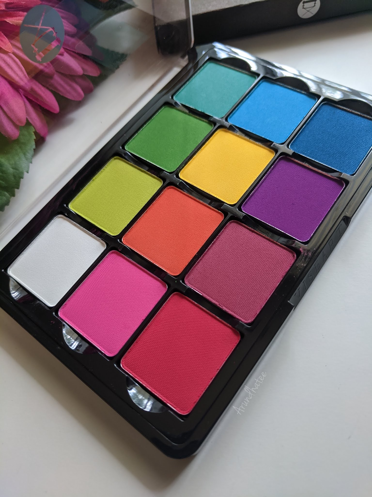
Color Story: This is one of the very classic palettes offered by Viseart! As the name suggests, it is full of vivid colors - pinks, reds, blues, greens and purples. And there is also a white which is quite convenient cause you can mix white with the other colors to create pastel versions of the colorful shades. One thing that bugs me a little bit is how the colors are arranged (they seem random to my eyes) but these are removable pans so you can easily interchange and arrange them per your choice. Let's talk about the colors one by one -


White: Beautiful white shade, it shows up on my olive Indian skin-tone. It also mixes well with other shades so definitely a very useful shade in the palette. 

Pink: Beautiful vivid pink, very easy to work with as well. Pinks are not my go to choice for colors, but I do love using this one.

Red: Great red shade - easy to work with as well. My complaint with this one is that once you start blending this, it tends to turn into more of dark pink than red! It is still a great shadow to work with but I just hoped it would be more of a true red, may be more blue leaning then pink!

Lime Green: This is such a pretty lime green shade! Very comfortable to work with as well. 

Orange: This is a very bright, very coral type of orange. It is one of my fav colors in general to experiment with! So I of course, love it.

Magenta: This is the color in the palette that I don't gravitate towards much. It does not appear too different than the red and the purple. I mean, it works perfectly fine but it is not that interesting to me.

Bright Green: Another beautiful green. I expect this type of color to be a little difficult to work with but the one in this palette does not give me any difficulty with blending or while placing it strategically in a definite spot on my eyelid!


Yellow: Aah, this is one of my MOST favorite shades in this palette. It is such a happy yellow. And the great thing is that, it shows up as vibrant against my skin-tone as it appears on the pan. Using this color just makes me happy. 90% of time when I am using this palette, I invariably end up using this shade.

Purple: Another one of my MOST favorite shades. It is so vibrant and so easy to work with. I just simply love to use this color.

Sea Blue: I would have loved to have a little more sky blue type of a shade. This shade looks like the mixture of the Bright Green and the next blue. It also sometimes gives me a little bit of difficulty from time to time when I try to blend it. I can sometimes see harsh edges which gets a bit difficult to blend. So, I don't use this a whole lot.

Bright Blue: In general, blue is one of my favorite colors to wear on my eyes. So I was definitely harboring a lot of expectation from the blues in this palette. But these blues were not as perfect as I hoped them to be. This one also creates a bit difficulty from time to time while blending, and I can see harsh edges sometimes which is a little bit annoying. They are not bad at all, but my Viseart standard I would have wanted them to be just a little bit more smooth and easy to get a seamless to blend.

Dark Blue: Same experience as the other two blues. It also feels a little bit rough on the skin than the rest, I feel it when I swatch it but on the eyes it is not that detectable. I love this color though.


I know I am complaining about the blues, but I am only complaining because I love Viseart mattes and I am kind of spoiled by that. So by that standard, these blues could have been a bit more smoother. But I do know that they are much better than some other blue matte shades I have in my collection from different brands.


Formula and Staying Power: I love Viseart! And I just LOOOOVE their mattes. They are so easy to work with; needs very little effort in blending and depending on the force and pressure I am using on my brush, I can get different depths of the same color. Typically, I will need a lot of time doing this with other brand's shadows but for Viseart the effort required is much much minimal. I also love the  staying power. I do use primer every time I work with any eyeshadow. And these stays on all day. 

Packaging: As you can see, the packaging of Viseart 12-pan regular size palette has a minimalistic industrial look. I find it very neat. The packaging is made of sturdy plastic material. There is no mirror and the lid is clear which makes it easier to see the shades inside. It makes complete sense because these were built compact and easy-to-work-with in a professional environment for makeup artists. A mirror would have come in handy for an everyday user like me but I actually absolutely love this no-nonsense type of packaging. Their newer packaging are much thinner and the pans are removable which makes it even more flexible. I can interchange this with my other Viseart palettes which will come in handy to build custom color stories when I am travelling. 

Price & Availability: These 12-pan regular size palettes by Viseart is priced at $80. It is an expensive palette but for me personally it is totally worth it. I also bought it directly from Viseart during their Labor Day sale so I got it at a discounted price. I would definitely recommend to wait for some good sale. You can buy the palette from ViseartSephora (currently unavailable), Muse Beauty ProBeautylishCamera Ready Cosmetics and Frends Beauty.

Here are some of the looks I created using this palette. What do you think?


I am ABSOLUTELY in love with this palette! After using it for more than a year now, I know that I will be constantly using and loving it for days to come :-)

Love,

~Arrru

Tuesday, October 8, 2019

Viseart Dark Edit Eye Shadow Palette ::: Review & Shadows!!!

I am back with a detailed review of a brand new eyeshadow palette. The last time I blogged about a new ‘makeup” product (URBAN DECAY x Kristen Leanne Kaleidoscope Dream Eyeshadow Palette), was back in February of 2018. After that I took a little break from all kinds of Social Media  😊 as I had to tend to some life priorities! I have a blogpost here if you want to check out in detail why I was gone! 

After being somewhat unaware of all the happenings in the beauty world during the time of my absence, I realized that these days there are just way too many beauty launches. It is almost fatigue-inducing! Personally, going forward I will not review a whole lot of new products like I used to do 2-3 years ago! Rather I will invest in products that truly intrigues me and promises to ‘spark joy in me’! Let’s be real, I already have an exorbitant amount of makeup items. 

Viseart Dark Edit Palette is one such product that genuinely interested me! I am quite familiar with Viseart eyeshadow and the colors looked awesome! Given that Fall has started here and those gorgeous red, orange, magenta and yellow fall foliage has started to show up, this palette seems very fitting!  

This time, I tried to be a bit consize and to-the-point in my review 😊 

Price, Packaging & Availability: Viseart is an expensive brand; there is no doubt about that. The cost for this particular palette is $39 before taxes for a total of 0.42 oz. (12 gr) of product. Each shadow contains 0.035 oz. of product. For comparison their Petit Pro palette (reviewed here) contains 0.208 oz. (5.9 gr) of product for $30. So Dark Edit Palette will cost you $92.5 per oz. while the Petite Pro Palette will cost you about $144 per oz. Their original 12 pan eyshadow palettes (reviewed here & here) comes with 0.84 oz. for $80 at $95.23 per oz. So, as you can see there is a little bit of saving! Plus for someone like me who has a larger collection, smaller sized eyeshadow pans work the best. If you are just dipping your toes into Viseart shadows and you love these type of darker shades, this palette would be a good one to start with.

Packaging is just like their Petit Pro palette. It has a magnetic snap-closure with the two side a bit exposed. It is tightly close but I do wonder if over time, dust will get into the shades! It does come with a mirror unlike their regular 12 pan eyshadow palettes. Because of its tiny size, I am excited to carry this with me during my Fall travels. And the fun thing is that the pans are removable magnetic pans; you can mix and match these shadows from palette to palette.

You can find this palette on SephoraBeautylish and FrendsBeauty.  


Formula & Quality: As I previously mentioned, I love Viseart eyeshadows. Their matte shades are phenomenal! They are extremely smooth in texture and VERY pigmented. That essentially means that they can be blended on the lids very easily without much effort. Of course, depending on the shade the pigmentation and performance will somewhat vary! 

When I first bought their 12-pan Bridal Satin palette, I did not enjoy the texture of the (satin) shadows much! But I think Viseart has now improved the quality of their shimmer shades! All four of them in this palette performed as beautifully as I have expected! I only wished for SIENNA to be a tad bit lighter; I could have used it as my crease shade. In all three looks, I had to use one additional crease shade from Makeup Geek. If you have darker skintone than mine, I think you can use one of the matte shades as the crease shade but if you are lighter than me, I am afraid you will need to get an additional lighter crease shade to fiish off your looks. But I am not really complaining here - the name of the palette is Dark Edit so I will be foolish to demand lighter shades  😊.


Here are the shades: 
TOFFEE: Personally, for me it would have been more useful if this was a tad lighter. I still love it and find great use for it. Beautiful shade with great smoothness and buttery texture.
SIENNA: Another quality matte shade. No matter what is your skintone is, this will offer you lot of use and versatility.
SEPIA: Another gorgeous shade. It is quite close to SIENNA but I do still enjoy the shade! I can control the shade to show up more vibrantly or just as a lighter shade.
PERSIMMON: Ah... this is definitely my most favorite shade. Very orange, very bold, very vibrant! Everything that I love in a eyeshadow! Very pimented so while using it, start with a light hand. 
OLIVE: It is a very pale shade, but I actually love it for wearing to work. It is subtle but very elegant. It is, however, a little weak in pigmentation. I needed 2-3 coats for it to show up vibrantly on my lid in the 3rd look.
BEAUJOLAIS: On the palette, this shade looks so different than the next shade, LAVENDER! It looks much deeper and less vibrant. On the swatch or on the eyes however, the difference is less pronounced. Both are gorgeous shades though!
LAVENDER: This shade looks very vibrant on the palette. But on the lid, it does not transform that vibrantly. It is still is beautiful! Very smooth and buttery!

FORET: Absolutely beautiful shade! Very pigmented! It is a perfect mix between purple and navy! Such a buttery smooth matte shade. Very rich! It is not common to have this deep of a shade in such a beautiful buttery smooth texture. Of course, one of my favorite shades in this palette.

TOFFEE, SEPIA on the crease; SIENNA on the outer crease, FORET on the very outer crease. 
Very little of LAVENDER and BEAUJOLAIS on the crease; very little. CALYPSO on the entire lid. 
Calypso on the inner corner of the lower lash-line and FORET on the entire lower lash-line.
Heavy handed application of PERSIMMON on the crease. 
Light handed application of SIENNA on the inner and outer corner of the lid. 
BURNISHED COPPER on the entire lid applied with a brush. 
BULLION applied with fingertip on the very center of the lid! A little bit of Sepia on the lower lash-line.
TOFFEE on the crease, SEPIA to deepen the crease. OLIVE on the lid applied with a brush. 
I had to apply 2-3 layers to get it to show up more vibrantly. 
SIENNA on the lower lash-line topped with ABSINTHE in the inner lower lash line.

BULLION: Very pigmented! This shade has minuscule glitter - it looks so pretty! I used it in the 2nd look - just a little tap with my fingertip at the center of the lid! And it took the entire look to a new level. 

BURNISHED COPPER: This kind of copper shade is one of my very favorite type of shades to play with! It really compliments my skintone and immediately makes me look and feel glamorous. Very pigmented as well. 

CALYPSO: This is also a very pigmented shiny shimmery shade.  I abosultely enjoy this shade. It’s a fuschia/pink, a bit too girly for my taste but I am quite surprized to realize how much I enjoyed wearing it. 

ABSINTHE: Among all the shimmery shades, this has the least pigmentation. I had to put a little bit of effort to work with this one;  nothing major, just in comparison with the other three shades. 

First look after 9 hrs of wear!
All my Viseart Palettes for comparison!
Here are my other Viseart palettes for comparison. While the colors are not exactly duplicates but there are some resemblance! 

Overall, I am enjoying playing with this palette :-)

Love,
~Arrru