Sunday, January 2, 2022

Viseart Holiday 2021 ::: Petit Fours - Lapis, Peridot, Garnet & Bullion Palette Review & Swatches!

Talking about the Petit Fours - Lapis, Peridot, Garnet & Bullion from Viseart's Holiday Collection this year!


Full disclosure: Viseart gifted me this palette along with their other Holiday palettes but with no obligation to post!

As found in their website - "unashamedly hedonistic and luxe these fab Petits Fours are high octane moments of glorious glamour. Whether you are drawn to the classic gold and black drama of Bullion, the fiery fabulousness of Garnet, the deeply elegant and enigmatic Peridot or exuberantly exquisite Lapis we have just the Petit Four for you."

Here is the thing - I don't like four pan palettes. It gets too restrictive for me. I much rather prefer single shades or medium to bigger size palettes. I am so glad they sent me these gifts, and I appreciate it so much. Otherwise, I don't think I would have invested in any of the four-pan palette. 

Formula: I think at this point I am repeating myself, but I really love Viseart's formula. I adore their matte shadows - they are so easy to work with. At this point, I have used all of the shades at least once, and they are all wonderful to work with. I did not own a matte black from Viseart before and Glided from Bullion is so good. There are different types of shimmery shadows within the four palettes and they are all so good. 

Color: As you can see, they focused on one primary/popular color to build the palettes, and I think they did a good job. None of the shades are exactly same but there are similar tones. Lets take a closer look.

Peridot: I am not a big fan of green as a color but I love this palette. They chose just the right tone of green. 

Greenlight - Described as forest green with a metallic finish. So shimmery & deep but still colorful - I love it.  

Gimlet - Described as a royal blue (I think its a typo) with metallic. I think it is the most beautiful psubtle parrot green type of shade. Very shiny. I really enjoy it.  

Gatsby - Described khaki with a metallic finish. Oooooh, such a good khaki shade. Very deep almost like a brown green shade. Great for adding depth or use as a liner.    

Illusion - Described as soft, neutral buff-brown with a matte finish. Only skin-tone shade among these four palettes that is useful for me. Great for using on my crease. 

Bullion: We love a gold and black theme for holidays, right?  

Brazen - Described as antiqued gold with metallic finish. It is a little bit particle-y to touch but on the eyes, that is not a problem.  

1919 - Described as medium gold with a metallic finish. Not too warm, not too cool.  

Follies - Described as light gold with a metallic finish. Much cooler tone than the other two golds. 

Gilded - Described as natural black with a matte finish. I did not have a matte black from Viseart before, so I am super happy about that. It is perfect. I blend it to the high heaven for one look and it did not have much fall-out at all. It does not necessarily swatch that strongly, but I am very excited about this particular shade.  

Garnet: As the name suggests, the palette showcases the garnet shade. They included two gold -like shades but I would have loved if there were more pinks or reddish shades compared to gold.   

Cordial - Described as rich burgundy with metallic finish. Love it - I am very sure I will be able to use it in many different ways into my eye-looks.   

Vedette - Described as copper with a metallic finish. I love coppers, it really suits by brown eyes. Also this finish on this shade is so smooth. Definitely a favorite.   

Cabaret - Described as golden bronze with a metallic finish. Nice shade - nothing spectacular about it.  

Pigalle - Described as vanila-peach with a matte finish. Okay, this is where my actual complain starts. It is a very light beige shade. Does not do much for me and I am sure skintones darker than me has the same problem. 

Lapis: I absolutely love BLUE eyeshadows so obviously this is going to be my favorite among these four palettes.   

Night Owl - Described as royal blue with metallic finish. I am in love with this shade. So strong, so impactful and such a deep but bright blue shade. Performs extremely well.    

Bauhaus - Described as silver with a metallic finish. Another beautiful shade. I have only used it once so far, need to use it more.    

19th - Described as golden nude with a metallic finish. Nice shade - nothing spectacular about it.

Blue Moon - Described as vanila-peach with a matte finish. So, yes, it is quite similar to Pigalle. So same problem. Formula is perfect but the shade does not work for me.   

As I mentioned before, my main complain is that out of 3 skin-tone mattes among these four palettes, two of them are very similar light beige and the other one is just slightly darker. I think they could have added at least one much darker skin-tone shade. 

Staying Power: I always use eye primer with my eye looks. But I love their formula - it has great staying power. It stays put till I remove at night when I wash my face.

Packaging: Simple practical packaging. one of the reason I struggle with petit four palettes is the storage. Not my favorite. But that's a personal problem. I do enjoy the fact that I can mix & match these shades to create my own palette. 

Price & Availability: This palette will cost you $25 at full price for a total of 6 gram or 0.21 oz. But this is holiday season so I am quite sure you will get some discount or other. Also it is very easy to find Viseart these days; they retail at their own website (Viseart), BeautylishCamera Ready Cosmetics, and Muse Beauty Pro.

Here are some of the looks I created using these palettes so far! Do you have any favorites? Which color story intrigues you the most?


Lastly some video swatches! Such pretty shades!


Love,

~Arrru

Friday, December 24, 2021

Viseart Holiday 2021 ::: Paris Etoile Palette Review & Swatches!

Talking about the Paris Etoile Petit Pro Palette from Viseart's Holiday Collection this year!


Full disclosure: Viseart gifted me this palette along with their other Holiday palettes but with no obligation to post!

Viseart describes this palette as a constellation of smokey cool midnight mattes and cosmically lustrous shimmers to celebrate the eternal beauty of Parisian jazz clubs and luminous, opalescent shimmers. I don't gravitate towards cooler toned palette so the color scheme of the palette is quite uncommon within my collection. I probably would have shades individually among ALL of my palettes, but as a palette it is unique and I really love that. May be suddenly my life will change and I would go onto some wonderful parties where I will get to sport these uber cool smokey looks and then this palette will be my best friend 😍. 

Over the past few years, Viseart has been curating palettes in different formats which are more approachable by general consumer compared to their original lines that were primarily created for Makeup Artists and Professionals. This particular one is on the smaller side with 8 shades and they call it Petit Pro. 

Just looking at the palette you can see, all the shades here are quite contrasting! You have some very deep mattes, along with some deeper shimmers and on the other hand you have two beautiful beige-y pinky shimmers. I am not someone who gets drawn in to this color scheme, but as of now I am really loving the whole vibe of this palette! I will see if the love stays in the coming weeks.  

Formula: I think at this point I am repeating myself, but I really love Viseart's formula. I adore their matte shadows - they are so easy to work with. This palette has a deep grey, a deep midnight blue and a deep grey-purple in matte formula. These are not the easy colors to use when they are in matte formula, so my recommendation is to slowly build it up rather than going on strong in the beginning. I still do find them quite easy to use, blend and place strategically. I have used this palette two-three times, and I am really impressed with Montmartre and Choisy.  I often overlook their shimmers because I am just so mesmerized by their mattes. But the shimmers here are beautiful as well. 

Color: I already talked about the colors but let's take a closer look!

Fontaine - Described as pink champagne with a shimmer finish. So shimmery - I love it.  .

Vavin - Described as light beige with a matte finish. Hmm, a tad bit disappointed. I don't really need another beige matte. I think we have had enough of those. I would have preferred at least a few shades deeper. I think that would have been more universally useful. 

Raspail - Described as bitter charcoal grey with a matte finish. I don't feel any interest in this type of color but man, this is such a necessary color in this palette. I feel like you will need to use this in some capacity or other no matter what type of look you are going to create.   

Fleurus - Described as midtone eggplant purple with a shimmer finish. What a gorgeous shade! In this look below, this is the main shade that makes the whole look. It has such a beautiful deep black purple base topped with various sparkles. Hands down my favorite shade in this palette 😍.

Montmartre - Described as steel french blue with a matte finish. Another one of my favorite shades! It is so good! I have used it as blending shade 2-3 times till now and aha, it is so easy to work with. 

Choisy - Described as smoked blackberry with a matte finish. Beautiful shade! Love how subtly colorful it is. Mixed with Fleurus creates the most beautiful purple smokey eyes. 

Montparnasse - Described as crystalline lilac with a metallic shimmer finish. This has a much cooler vibe than Fontaine even though they may appear similar. So sparkly! Beautiful as a inner corner highlight. I am dying to try it on my lid for my next look.

Mouffetard - Described as midtone eggplant purple with a shimmer finish. Very beautiful shade and the most essential shade that gives the whole palette that smokey vibe. Love it. 

Staying Power: I always use eye primer with my eye looks. But I love their formula - it has great staying power. It stays put till I remove at night when I wash my face.

Packaging: I love these petit pro palettes, I have one from before and they are so good when it comes to travelling. And the outer packaging with tiny stars and moons with steel blue color and Paris skyline is so good. Their palettes now has mostly removable magnetic pans which are amazing in case you want to create custom color schemes. I really love that about their newer packaging styles.

Price & Availability: This palette will cost you $30 at full price for a total of 8 gram or 0.28 oz. But this is holiday season so I am quite sure you will get some discount or other. Also it is very easy to find Viseart these days; they retail at their own website (Viseart), BeautylishCamera Ready Cosmetics, and Muse Beauty Pro.

Here is a look I created using only this palette so far, I have used it with their Lapis palette which created a beautiful look and I am sure I will play with it more and have more fun.


Lastly some video swatches! Such pretty shades!


Did you pick up any palette from this holiday collection?

Love,

~Arrru

Saturday, December 18, 2021

Viseart Holiday 2021 ::: Bijouxette Etendu Palette Review & Swatches!

Talking about the Bijouxette Palette from Viseart's Holiday Collection this year!

Full disclosure: Viseart gifted me this palette along with their other Holiday palettes but with no obligation to post!

If you are a makeup lover who ended up here from my Instagram, you already know that I absolutely adore Viseart Eyeshadows. The first palette I ever tried from them was the 12-pan Dark Matte palette and I have been a fan ever since. 

Over the past few years, Viseart has been curating palettes in different formats which are more approachable by general consumer compared to their original lines that were primarily created for Makeup Artists and Professionals. And out of this year's holiday collection with all different types of palettes, I have to say that Bijuoxette has my heart! I was planning to purchase it on my own actually.

First, look at the color scheme! Isn't it the most comprehensive colorful palette!? I mean you got 4 perfect mattes, I feel like this is a great array of mattes that can be very useful for all different types of skin-tone. Then you got 2 beautiful golden shimmer shades that will definitely please you if you are a neutral lover. And lastly, beautiful colorful shades! I am very big fan of colors - the  greens & blues, the deep garnet and purples and also that beautiful orange! I think, I think, I think this palette was made for me! 

Formula: Before I had this holiday collection, I already had 6 palettes from Viseart. So that should already tell you how much I love their formula. I adore their matte shadows - they are so easy to work with. I can blend their mattes with ease, I can place them strategically without getting muddy, I can mix them with lighter or darker shades to make them deeper or brighter. Even with deeper mattes like blue or dark green, I find them comparatively much easier to work with than some other brands. And because their mattes get more love from me, I don't pay much attention to their shimmers 😄! But they are also such a joy to work with. They are opaque, very shiny and almost minimum to no fall-out. I prefer using them with my fingertips than using with a brush.

Color: I already talked about the colors but let's take a closer look!

Nouveau - Described as base or midtone beige taupe hue with a matte finish. I don't the see, but it is a beautiful shade that I can use as a brow-bone highlighter. If you have lighter skin-tone than me, this will be good crease shade for you.

Ruby - Described as warm wine tone with a matte finish. I love this type of deep maroon-y shade. A perfect crease shade for me for warm looks- neutral or colorful!

Carnelian - Described as Demi-matte pumpkin orange with flecks of reflectivity. I don't particularly care for this type of finish, I feel like the speckles are useless because when I use the shades on my eyes, I lose the speckles. But I love the color. I can see myself using this shade as a matte shade.

Scandalous - Described as teal metallic duochrome. Such a gorgeous shade! I love it. It is not entirely blue or green which means it goes seamlessly with either blue or green looks. I know I am going to grab for this color so very much 😍.

Speakeasy - Described as burnt dark chocolate with a matte finish. I love this shade! It is so good! I can use it as a crease shade or to deepen up my outer corner area.

Prohibition - Described as antiqued gold with a demi-duochromatic metallic finish. Beautiful shade but it is a typical shade so I don't necessarily feel any extra pull for this shade!


Sidecar - Described as warm midtone toffee with a matte finish. Woohoo! Another matte shade I absolutely adore. It is the perfect crease shade for me. And I think it is a shade that every person (irrespective of their skin-tone) can find great use for.

Sequins - Described as midtone golden amber with a metallic finish. VERY gold, I love this shade. Again it is a somewhat of a common shade, but I do appreciate a good gold shade! Very metallic, very opaque, very beautiful.

Deco - Described as raspberry with a metallic finish. Beautiful warm deep pinkish maroon shade. It is very red leaning which is somewhat uncommon within my collection. I will definitely use this shade a lot.

Cubism - Described as sapphire blue with a demi-duochromatic metallic finish. Oooooh, I absolutely love this shade. And I do see a very light pink duochrome over the sapphire blue. I used Scandalous, Cubism and Jade together in one of my look, and I loved the outcome...it was such a good blue eye look. 

Jade - Described as majestic green with a metallic finish and majestic right! This is a shade that goes so well with so many different shades. I can already, this is going to be one of my favorite shades from the palette.

Velveteen - Described as midtone purple with a demi-matte duochromatic metallic finish. Another one with a very light hue duochrome. Love it!  


Staying Power: I always use eye primer with my eye looks. But I love their formula - it has great staying power. It stays put till I remove at night when I wash my face.

Packaging: This is their Ettendu palette so it follows a typical sizing, I love the green festive outer cover too! Their palettes now has mostly removable magnetic pans which are amazing in case you want to create custom color schemes. I really love that about their newer packaging styles.

Price & Availability: This palette will cost you $44 at full price for a total of 18 gram or 0.63 oz. But this is holiday season so I am quite sure you will get some discount or other. Also it is very easy to find Viseart these days; they retail at their own website (Viseart), BeautylishCamera Ready Cosmetics, and Muse Beauty Pro.

Here are the 3 looks I created using only this palette so far, I am sure I will play with it more and have more fun.


Lastly some video swatches! Such pretty shades!


Did you pick up any palette from this holiday collection?

Love,

~Arrru

Thursday, November 25, 2021

KEVYN AUCOIN Glass Glow Face ::: Review & Swatches!!

Talking about Kevyn Aucoin Glass Glow Face today. The shade I have is Prism Rose.

Back in 2020, I got a sample foil card of this highlighter with 3 shades – Crystal Clear, Prism Rose and Spectrum Bronze. I travelled with that little card and it was perfect for my 5-day trip to Sri Lanka (Read my travel experience here). It impressed me so much that I really wanted to get it in full size. After a lot of researching and a lot of waiting, I found a deal in October (of 2020) in Beautylish and finally got my hands on the full-size for the shade Prism Rose. After using it for one full year I am still impressed and happy with my purchase.

Their website describes this highlighter as an universal and unique gloss highlighter for both face and body for a youthful looking hydrated skin with a glassy complexion. I haven’t used it on my body yet but for the face, it definitely gives me the glassy glow & I love it.


Formula: The formulation of the product is definitely a tad bit unique. It is not a liquid but definitely like a liquid balm. You need just a LITTLE bit of product. I use my finger tips to apply the product and blend it using my fingertips. If I feel I need to get a more natural look, I will use a beauty blender. My skin is very dry and with each passing year, I have started to realize that powder highlighters have the possibility to look a little bit forceful on my skin. I have definitely started to prefer creams heavily over powder highlighters.

And I definitely love this formula, it could feel a little bit sticky when you first squeeze it out but I don’t really find that to be a problem. It applies very easily, blends very easily and the stickiness does not really linger.

Color: There are total of 6 shades in this formula. I liked the clear one but at times it could look a bit ashy on my skin-tone. The other shade I tried was Spectrum Bronze – very pretty shade but somewhat darker on my skin-tone. So, I chose Prism Rose for my full size and I am so glad I did. It is a very pretty rosy type of shade with bronzy-tone hues. It has neutral undertone so it can be very easily used with cool or warm toned makeup looks. I can use it when I want a simple basic look or with ultra glamorous one. I am very happy with my shade selection.

Staying Power: Ok so, for makeup looks to stay-at-home this has the perfect staying power. I have worn it with looks for full content days (you know, days involving outfit changes and dance reels) and it stays put – so I really cannot complain. Because the product looks so natural, even if it fades it still look pretty. But I have not used it for a full outdoor activity day, so!

Packaging: This comes in a squeezy tube. It’s a big tube so not quite sure how easy it is to travel with. The cap also can be loose and keep reopening. However, for everyday storage that’s not a problem.

Price & Availability: The full size contains 1 fl. oz. with a price tag of $32. That’s a lot of highlighter! $32 seems like a hefty price tag but I feel like price/unit is reasonable. But that’s my personal thought. I bought it at half price – so I am definitely getting full worth the money I spent.

Here are some looks where I used the highlighter!


Overall, I am thoroughly enjoying this product. It looks natural, glamorous and for the last few months, I am definitely picking it over my other highlighters.

Love,

~Arrru 

Wednesday, October 6, 2021

Products I've Used Up/Empties Vol. 25

Alright, time for another set of empties. I have not been wearing a lot of makeup these days but I am glad that I am still being able to finish up products.

I typically talk about empty products one by one but I am lazy this time around plus most of the items from this bunch are my regular go-to products. So no point in talking about them separately.


Out of all these items, I absolutely loved @pravana Hair Oil and @hairfood Repair Shampoo. I want especially repurchase the Hair Oil and @hairfood Repair Shampoo but I have not really figured out where to buy them from yet! I loved the @playa California Salt Shampoo as well. @freshbeauty Sugar Lemon Body Lotion was absolutely lovely but also expensive so I don't plan to repurchase it right away! May be some day! The @olehenriksen products are my go to especially in summer!


That's all for today,

Love

~Arrru
Thursday, September 9, 2021

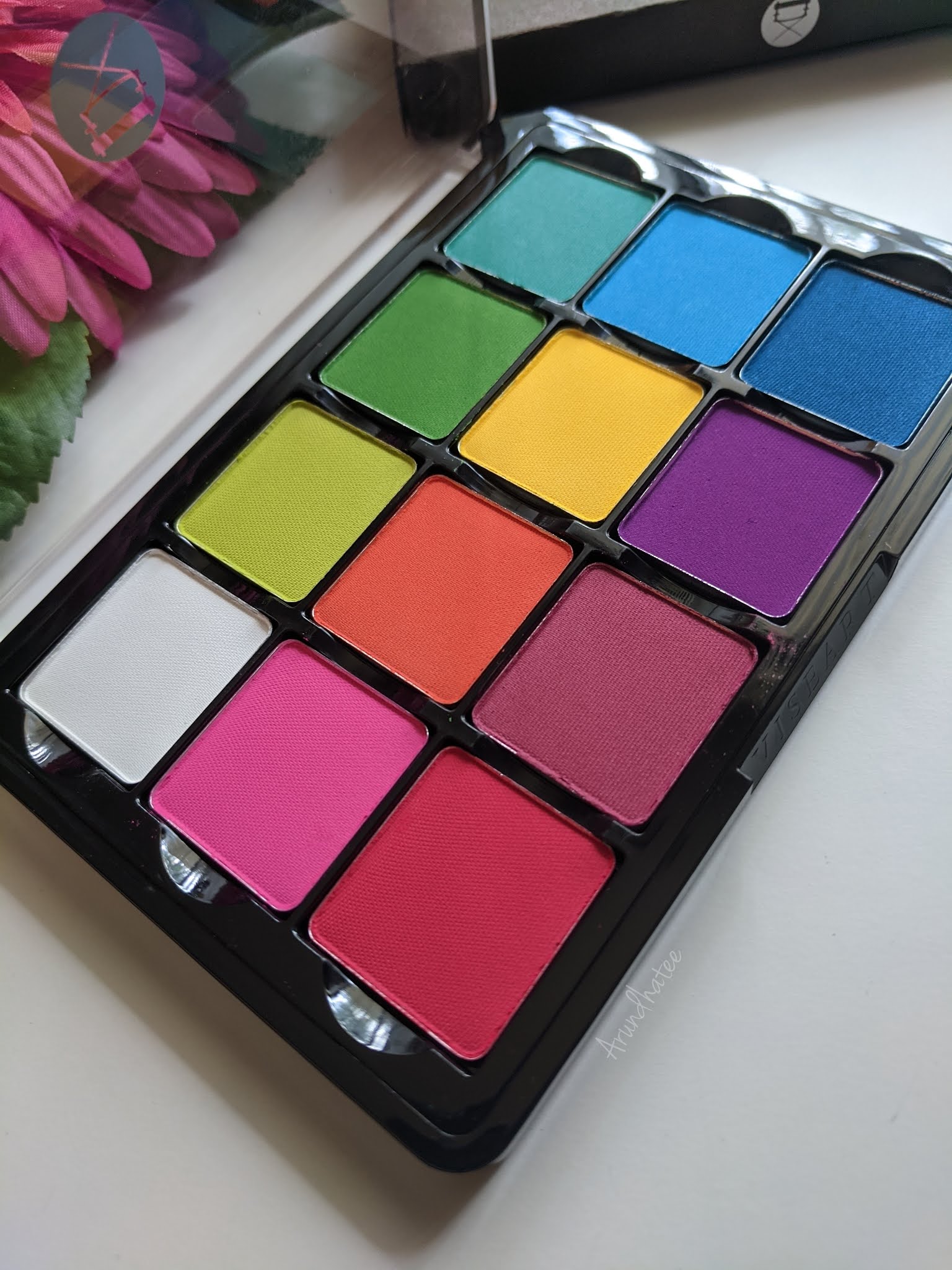
Viseart Editorial Brights Eye Shadow Palette ::: Review & Shadows!!!

Today, I am talking about Viseart Editorial Brights palette!

I actually do not think I really need to specifically talk about it! If you follow me on Instagram (find me here) you may already know how much I adore this palette. I got it sometime last year and I have been using it in a lot of looks. And of course have been talking about the palette on my IG posts non-stop!

I love vibrant colors and I have desired this palette for a long time. And I knew that I will love it. But it is definitely becoming one of the most loved products in my makeup collection! If a materialistic item could make me TRUELY happy, this palette would be among the top five item in my life; I know it is a dramatic statement but I am only expressing my feelings. 


Onto the review -

Color Story: This is one of the very classic palettes offered by Viseart! As the name suggests, it is full of vivid colors - pinks, reds, blues, greens and purples. And there is also a white which is quite convenient cause you can mix white with the other colors to create pastel versions of the colorful shades. One thing that bugs me a little bit is how the colors are arranged (they seem random to my eyes) but these are removable pans so you can easily interchange and arrange them per your choice. Let's talk about the colors one by one -


White: Beautiful white shade, it shows up on my olive Indian skin-tone. It also mixes well with other shades so definitely a very useful shade in the palette. 

Pink: Beautiful vivid pink, very easy to work with as well. Pinks are not my go to choice for colors, but I do love using this one.

Red: Great red shade - easy to work with as well. My complaint with this one is that once you start blending this, it tends to turn into more of dark pink than red! It is still a great shadow to work with but I just hoped it would be more of a true red, may be more blue leaning then pink!

Lime Green: This is such a pretty lime green shade! Very comfortable to work with as well. 

Orange: This is a very bright, very coral type of orange. It is one of my fav colors in general to experiment with! So I of course, love it.

Magenta: This is the color in the palette that I don't gravitate towards much. It does not appear too different than the red and the purple. I mean, it works perfectly fine but it is not that interesting to me.

Bright Green: Another beautiful green. I expect this type of color to be a little difficult to work with but the one in this palette does not give me any difficulty with blending or while placing it strategically in a definite spot on my eyelid!


Yellow: Aah, this is one of my MOST favorite shades in this palette. It is such a happy yellow. And the great thing is that, it shows up as vibrant against my skin-tone as it appears on the pan. Using this color just makes me happy. 90% of time when I am using this palette, I invariably end up using this shade.

Purple: Another one of my MOST favorite shades. It is so vibrant and so easy to work with. I just simply love to use this color.

Sea Blue: I would have loved to have a little more sky blue type of a shade. This shade looks like the mixture of the Bright Green and the next blue. It also sometimes gives me a little bit of difficulty from time to time when I try to blend it. I can sometimes see harsh edges which gets a bit difficult to blend. So, I don't use this a whole lot.

Bright Blue: In general, blue is one of my favorite colors to wear on my eyes. So I was definitely harboring a lot of expectation from the blues in this palette. But these blues were not as perfect as I hoped them to be. This one also creates a bit difficulty from time to time while blending, and I can see harsh edges sometimes which is a little bit annoying. They are not bad at all, but my Viseart standard I would have wanted them to be just a little bit more smooth and easy to get a seamless to blend.

Dark Blue: Same experience as the other two blues. It also feels a little bit rough on the skin than the rest, I feel it when I swatch it but on the eyes it is not that detectable. I love this color though.


I know I am complaining about the blues, but I am only complaining because I love Viseart mattes and I am kind of spoiled by that. So by that standard, these blues could have been a bit more smoother. But I do know that they are much better than some other blue matte shades I have in my collection from different brands.


Formula and Staying Power: I love Viseart! And I just LOOOOVE their mattes. They are so easy to work with; needs very little effort in blending and depending on the force and pressure I am using on my brush, I can get different depths of the same color. Typically, I will need a lot of time doing this with other brand's shadows but for Viseart the effort required is much much minimal. I also love the  staying power. I do use primer every time I work with any eyeshadow. And these stays on all day. 

Packaging: As you can see, the packaging of Viseart 12-pan regular size palette has a minimalistic industrial look. I find it very neat. The packaging is made of sturdy plastic material. There is no mirror and the lid is clear which makes it easier to see the shades inside. It makes complete sense because these were built compact and easy-to-work-with in a professional environment for makeup artists. A mirror would have come in handy for an everyday user like me but I actually absolutely love this no-nonsense type of packaging. Their newer packaging are much thinner and the pans are removable which makes it even more flexible. I can interchange this with my other Viseart palettes which will come in handy to build custom color stories when I am travelling. 

Price & Availability: These 12-pan regular size palettes by Viseart is priced at $80. It is an expensive palette but for me personally it is totally worth it. I also bought it directly from Viseart during their Labor Day sale so I got it at a discounted price. I would definitely recommend to wait for some good sale. You can buy the palette from ViseartSephora (currently unavailable), Muse Beauty ProBeautylishCamera Ready Cosmetics and Frends Beauty.

Here are some of the looks I created using this palette. What do you think?


I am ABSOLUTELY in love with this palette! After using it for more than a year now, I know that I will be constantly using and loving it for days to come :-)

Love,

~Arrru